Welcome to The Writing Coach. On this podcast, I speak with the instructors, editors, coaches, and mentors who help writers and authors create their art, build their audience, and sell their work.
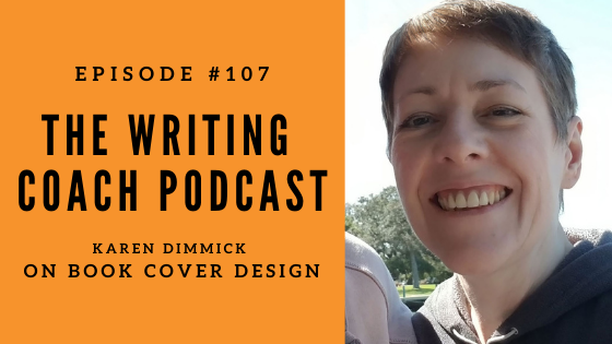
In episode #107 of The Writing Coach podcast, I speak with author and book cover designer Karen Dimmick.
Karen previously appeared on episode #35 of the podcast, where we discussed mind hacks for writers. These days, Karen is a book cover designer creating custom and premade book covers. Her goal is to create covers that capture future readers attention and sell books. Karen specializes in Fantasy and Science Fiction. Karen covers Urban Fantasy, High/Epic Fantasy, LitRPG/GameLit, Harem/Reverse Harem, Paranormal Romance, Dark Fantasy, Sci-fi and Paranormal Fantasy book covers.
During our discussion, Karen describes:
- What makes a great book cover
- Why genre is so important to cover design
- Who book covers are really for
- The importance of font choice on covers
- Four different types of books covers
- How to get the most out of working with a freelance cover designer
- the benefits of both custom and pre-made covers
- And much more!
Listen to the full podcast episode:
Watch the unedited video of the conversation:
The Writing Coach Episode #107 Show Notes
Visit Karen at the Arcane Covers website.
Episode Transcript
Today on the podcast I have Karen Dimmick. Karen, welcome back to the Writing Coach.
Thank you. It’s great to be here.
It’s so funny. We were just talking a bit about the pandemic and you know, it’s been almost a year. I mean, next month it’ll been a year and I feel like it’s just this lost year, because when I think about last time we talked, it was the Writer’s Craft Summit and I’m like, well, that was just last year . . . only was it. It was two years ago because pandemic year, it’s just gone by in a flash. So how are you have of the last two years been for you?
Busy. It’s been good.
What have you been working on and kind of bring us up to speed on when you were last on my summit and on the podcast, we’ve talked about your work as a marketer or a book marketing expert, as well as an author. Um, focusing in on, on kind of the psychological side of writing, uh, bring us up to speed on where you’re at now.
Well, I started writing fiction.
That’s right. I remember you were, you were tearing through novels, right? Your manuscript, you were writing like really producing a ton of work.
It went quite quick. I mean, the first book was about that thick and, uh, I went through that and then I started talking to a publisher and they wanted to sign me just for the audio book. And then it sort of progressed a bit further and I wrote a book sort of one and a half and novella, which is about that big. And then I wrote book two, which is again about that big. And then they decided they wanted the whole lot. So I took them all off the market and, um, while I was waiting and things for it to get done, I was participating in the short story anthology. So I was one like pulling it all together, formatting it and stuff to get it out there. And about two days, I think it was before the anthology was due to launch the cover designer dropped out. So I’m like, okay, we need a cover. So, you know, I know Photoshop, I’ll have a go kind of thing. And I fell in love with cover design. Absolutely. And we put this thing up as a charity anthology. I did. Okay. You know, we didn’t, any of us promote it that much, but I just got the bug for cover designing. And I started going on courses for that. And since I think it was may April, may I started, um, as a full-time cup designer and I haven’t done any writing since
Amazing. Well, it’s fun how life can kind of take us in different directions in that I think if you’re a creative, artistic person who loves books, there’s a lot of opportunities, different career paths. You can take that industry.
Oh, there totally is. Yeah. And it’s a totally different side as well, coming from it because when I was an author getting my cover, I was like, very precious about the story. I know, I know her what her armor isn’t right. And now I’m a cover designer. I can see it from the other side. It’s like, yeah, it doesn’t matter. It’s what it sell the book. That’s all that matters.
You alluded to this idea that the writer has a certain vision of their cover and how it should look, but that the goal should actually be to sell the book. So who who’s a cover for really? Ah, let me, let me know what you were thinking about when you’re designing a cover. Are you thinking about the writer or I’m guessing more of the audience?
There’s actually three camps of people. You’ve got the writer, you’ve got their fans, the readers, and you’ve got the people who are yet to discover them. And the cover. Unlike what most people think is actually for the people who have yet to discover you, because you’re not going to buy the book on the strength of the cover. You wrote it so you don’t need to buy it. Your fans are probably not going to buy it on the strengths of the cover. They like your story. They’re going to want to read the next one. You’re right. So the people who are going to buy it on the strength of the cover and the people who’ve never heard of you, um, don’t really know anything about you, but Oh, that looks like an interesting story. So that is actually who the covers for that’s where you get new people in that you’ve never heard of that I’ve never heard of you and you do it on the strength of that cover followed by obviously the rest of it, like the blurb and things, once you’d get to the page, but the cover is what gets you to that page.
When you’re working with a client, you have to educate authors on this idea. Do you ever have to walk them through this process?
Yeah. Oh yes. I have so many authors who like, well, I want this on the cover and this on the cover and this on the cover. And I’m like, no one concept. One thing, because when you’re at thumbnail, which is when those readers or potential reader receive the first time, it cannot be, toped so busy that they go, I don’t know what that’s about and pass by. It’s got to have one idea and really clearly executed because that’s what draws them in,
I have heard covers should also work in black and white. Can you talk a little bit about why someone might recommend that?
Why don’t, you’ve got a subset of readers like me who read on a Paperwhite and everything is black and white. And when he reached the end of the book, you’re, you know, you’ve got to, I don’t know, five, six, whatever covers it is that are looking at you for your next purchase. And they’re all in black and white. So if your cover doesn’t work in black and white, they won’t buy it. It’s as simple as that. So you’ve got to have your cover work in black and white.
What makes a good cover? How does one know whether the cover they have for their book is good or not?
Well, the first thing I look for is can you see, especially if it’s a person covered a character based cover, can you see the outline of the person at least sort of shoulders up? Because we, as humans, we work by shapes. We recognize shapes and we associate them with a symbol, which is why we get things like stick figures. That’s a human to us. And we associate with that. And the most, the thing that we most like as a human, as another human. So seeing a human on a cover is very, very attractive. The trouble is, is if you have a dark like dark armor, so you’ve got a dark human and you put them on a dark background, you can’t tell it thumbnail that that’s a human. It just looks like a dark blob. So the best covers are going to be ones. You can actually see what’s going on.
You can associate the fact that it’s a human or in the case of Epic fantasy. It’s a beautiful, I don’t know, Vista castle or whatever it is, but you can see the things that the designer is needing you to see, to show what genre the book is. And the fact that it’s a pleasing shape and you don’t have to think what does that limb belong to that creature? Or is it in there? It’s obvious what it is that first glance. And they’re like, Oh, that’s nice. I’d like to know more about that rather than, Oh, that’s confusing. I’m passing by.
I think a mistake, some authors make is I think movie posters, we think of like star Wars or Harry Potter, these posters with like a bunch of different faces or images from the film collage together. And then they think, Oh, that’s what my book cover should look like. But obviously a film poster is meant to be displayed in this huge giant shape. Whereas a book is much smaller. So I think, do you think perhaps that’s why people go down that road of these way too busy covers with too much going on?
I think that’s part of it. Yeah. Because you do see all these, you know, sort of layers of, of characters, but like you said, it’s nearly as tall as I am and your book covers that size when they first see it. And um, but I think the other thing is the author is so close to the story that they wanted to get across the things that they see as important. And they’re important for the story, but they’re not necessarily important for the potential reader. Who’s never of you because all they want to know is, am I going to like this story? They don’t need to know that that rune means this. Or, and I’m talking about the mistakes I made and, uh, you know, that she’s got armor on her legs and things because you, again, you don’t want the focus down there. You want the focus up where you want and that one focal point. So you have to take the story with a kind of like grain of salt of like, yes, you want to get across. What’s important to the author, but you equally more importantly want to get across what the genre is and whether those non-fans the people who’ve never heard of, you will associate your story from that cover with a story they like in the same genre and therefore sink. Oh, they might enjoy that. I’ll try it.
Yeah. I think as a writer, you live in a world of details, right? And sometimes it’s hard to let go of those details. Totally is. I know that the cover, my second book economy of fear, I, my first book, um, was just a picture of a book with a hand coming out of, there was no human face. And you know, at the time my second book had come out, I’d, I’d heard what you already alluded to. We like to see human basis top. And so I wanted to get an angry teenage boy on my cover. Um, and that’s all that really mattered, right? Angry way to tell the reader, this is a book with a teenage boy in it. But in my mind, I’m like, is that what that character really looks like? What color would it be? Like at some point you gotta be, you gotta let go. And it’s like angry. Teenage boy is what matters. Not the length of his hair or the color of his eyes or whatever.
Yeah. Oh, it totally is. Yeah. You’ve got to get that genre expectation across and I’ve had authors comes a bit, but he’s got a lit an earring in his left ear. I’m like, okay. One picks up by one pixel. There’s the earring. They’re not going to see it, but okay. No one’s ever got notes except for the author, but it’s there. Yeah.
You alluded to character covers. That’s what we were just kind of talking about, but are there other different types of covers?
There’s actually four different types of covers. There’s the character focused cover, which you’ve got one maybe more, you know, three or four even characters that are decent sized so that you can see their face, their details, whatever it is about them. You can tell that the characters that the focus you’ve got sort of landscape focus covers, and these are more Epic fantasy where you see this beautiful sweeping vistas and a tiny little sort of representation of a person with a massive castle or mountains and things. And it’s more about that view and bringing you into the world, which is what a lot of Epic fantasy it’s like, then you’ve also got, what’s called symbol covers. So you have like a, a genus lamp or whatever, and the rest is just nondescript on it or a dagger or something like that. And again, they can work for fantasy. They can work for anything. They are harder to get across what I call the genre. So the things that the readers are looking for to, you know, show that yes, it’s that genre, but they do exist. And, you know, they do do quite well. And then lastly, you’ve got text covers and some genres do better with these, some do worse, but they are where the text is the focus. And there’s very minimal amounts of, um, images around it to kind of bring it together. So they’re the four types. Let’s talk about them,
Text a bit and font because I mean, I think this is a whole mysterious world. Is it, you know, everything in life is like a thousand times more complicated than you think on the surface, like fonts is one of those. You can go down this rabbit hole of fonts. And so as a, as a cover designer, this is, you know, I suspect an area you really become an expert in. Can you talk a bit about this world of fonts and, and how this ties into cover design?
Well, some fonts and that, you know, I’m sure you’ll notice when you look at them, they just make you think fantasy or sci-fi or horror or whatever the genre is. And so you have to get the right match of the font for the genre of the cover and for the match between the font and the artwork. It’s basically two pieces and you’ve got two focal points. One is the focal point of the artwork, and one is the title and you’ve got to make them play together well enough that it looks like one whole piece. And the choice of font plays heavily into that as does the styling on the font. If you do it too much, then you, you sort of lose the focus as much on the artwork. And if you do it not enough, you kind of lose the focus on the title and so on.
And the other thing you’ve got to think of with fonts is readability. I mean, again, you’ve got thumbnail. You want to be able to read it, at least roughly the title, some, some titles you can’t quite read, and it’s not, it’s not a desperate problem to not be able to read the title because you do in the Amazon listing having next to it. But it is something I always try and strive for, because I think it adds something to the cover when you can actually read that. Um, one of the things you’ve gotta be careful of is if you’ve got, say white font, don’t put it on the pale background. Cause getting you can’t read it, especially in black and white. Um, so you always want to have that balance of like dark against light or light against dark, and that will play into, you know, which fonts you pick. Cause again, skinny, super skinny fonts. They’re gonna be very, very difficult to read when they’re at thumbnail.
So again, kind of continuing this idea of fonts, but also images, you know, as an author, I’m not an expert in this stuff, but I’m somewhat familiar that there’s issues pertaining to licensing fonts though. You’re buying a fine, your ability to use a font, your ability to use an image in certain ways. Can you fill the listeners in, in the, in this world of, of licensing fonts and images and, and, and maybe what they should know when they’re looking to hire cover designer when it comes to that kind of legal side of using images.
First off, I’m not a lawyer. Um, what you need to be aware of is every image has some kind of license. And if you buy something from say, deposit photos, shutter, stock, any of those big sites, they will have a license that will tell you how you can use it. And invariably, what I do is I buy the standard license from deposit photos, which is where I buy most of mine. And they tell you that you can use it for like eBooks and things like that and print books and so on. And you can’t use it for things like merchandising, like t-shirts and things. Then you need the extended license and it’ll tell you all the details in the license, if you need to read it and stuff. And it is the same with fonts. Some of them will be commercial use. Okay.
Some of them will be, you can use it up to, you know, a thousand printed copies and things. So you have to be very aware as the designer and the author, what the licenses are and what you can and can’t do. But one of the, of the biggest thing you want to avoid is picking photos from a free stock site like Pixabay or, um, I can’t think of the others. Um, but there’s a whole bunch of them out there. Don’t use ones from there because if you do, you run the risk that someone uploaded, one that they shouldn’t have and they didn’t check. And you’re now on the hook. And I have seen people actually not in the cover design world, but in the website world, I’ve seen people, who’ve used an image that they downloaded from a free site. And they got a letter saying that they owed the person 10 grand and they came in, they hired a lawyer, they got it down to three grand with the, you know, sort of understanding that they take it off their website and so on. It is serious business. So you stuff that is licensed and the same with fonts, don’t just download one. That’s free for personal use, you know, make sure that you buy your fonts and you buy them with a license that allows you to use them, how you want to use them.
When someone is looking for a cover designer, uh, what sort of things should they be looking for? Because clearly someone who knows about this stuff is someone. Um, but what else? I, I’m a new author. I want to find a cover designer for my book. What’s my little checklist of things I should be looking for a cover designer.
But the first thing I’d look for is do they have a website? Because if they’ve invested in a website, that means they’re serious. They’re not going to disappear on you, book two, and you realize you’ve got the rest of the series to go. So find out they’ve got a website on that website will be a portfolio, start looking through their portfolio and make sure that they’ve designed it in the genre you’re writing in because if you’re writing in fantasy and they’ve got a whole bunch of post-apocalyptic, um, horror, thriller romance, then you don’t know that they can actually do a fantasy cover. So make sure that they got covers that are in the genre. You’re writing, make sure that you like their covers because frankly, what you’re seeing in their portfolio is the standard that you’re going to get. So if you don’t like it now, you’re not going to like what they do for you either.
So shot that you do like that. Um, next, make sure they’ve got some terms and conditions that say that they use licensed images and fonts because you don’t want to go down that road. Um, and then ask around, is there testimony or is on the site that you can read? You know, do people say they like working with them? Um, if there’s no testimonials, maybe, you know, go to the next one, um, and then start asking you off the friends as well. Who else designs in that genre that you like? And when you come to actually picking your designer, they should be sending you a questionnaire. And one of the things that I always ask in my questionnaire, and I think a lot of people do is what books in your genre do you like cut the covers off? You know, and what do you like about them? What don’t you like about them? Because then that’s going to give them a much deeper understanding of what it is you’re after.
It’s so interesting. It seems like almost every single aspect of covering design comes back to genre genre.
It is 100%. As an indie author, traditionally, a traditional publishing is different. They, you know, they have license to do more than we can, but as an indie author, especially a new one, the way people will find you is if they think your book fits into the genre and that they might like it, that’s the only way. And it is communicated via your cover to begin with, okay, your blurb we’ll do a lot of the work of the sale, but if they don’t like your covering, they’ll never see your blurb. So they’ve got to light that cover and they’ve got to tell them what genre it is.
Hiring a freelance cover designer can be quite expensive. I think we’ve already covered some of the reasons why normally the cover designer is purchasing stock photos or fonts. There’s, it’s, it’s a unique, um, uh, it’s not a mass produced product. It’s a, one of a kind product there’s expertise and artistic, um, experience coming into it. All these reasons can kind of inflate costs, but I understand there’s ways often to find, um, more affordable covers, perhaps I’m thinking pre-made covers. Can you fill the listeners in a bit on what what’s a pre-made cover and how might that, uh, help a reader, um, perhaps reduce some of the costs involved in hiring a cover designer?
Yeah, sure. Pre-meds are what they sound like. Really? They are a cover that’s already made and you can see it, you know exactly what you’re getting and you basically have the designer put your title in your name on it. And that there’s the changes. The advantage it is, they are pretty much, always less than, um, another advantage is, you know, exactly what you’re getting, um, because you’re looking at it. So there’s going to be no surprises and like, you know, you might have in the custom process or whatever, but the pre-made is exactly there in front of you. You know what you’re getting, uh, it’s also done by the designer for a specific genre. So, you know, all the genre cues are there and you know that it’s going to help sell your book and if it fits your story, great. Another thing with pre-made is you might see one, I think, Oh, that’s stunning.
Oh, and I can write the story around that. And a lot of authors buy pre-meds for this reason, they use it to inspire the story. So you don’t have to worry that, you know, it’s a guy, not a girl or they’re wearing leather armor and not, um, cloth armor, whatever it is, you’ve got that visual cue and you base your story off of the character or whatever it is on the cover. So there’s some big advantages to it. You know, there’s obviously the disadvantages of if you’ve written a story and you’re now looking for a pre-made that you might not get exactly what matches your story, but you know, you know what you’re getting and it is definitely lower cost.
I’m a big fan of pre-visualization. Um, I know some athletes will go sit in the stands before a game and kind of visualize the game. Uh, and something I did on my very first novel was I got my cover done while I was still completing the novel. And then I printed it out and I wrapped it around an existing book on my shelf, put it in there. And I was like, this is what it’s going to look like when my book is done, you know, I’m going to one day have a book sitting on a shelf. It was a little pre visualization exercise, but I thought it so inspiring. And so, um, I love that you talked about this idea that covers can sell books, but covers can also inspire ideas for books or inspire the effort to get to the finish line if you’re mid book.
Yeah, I totally can. And, uh, I actually got my cover done last, but I’m, you know, I can see so many authors who get it done way at the beginning and then they display it and it is their motivation to keep writing.
Do you ever have clients who come to you who say I did my own cover or I hired a cover? The book’s not selling or I’m not happy with it. I’ve realized I’ve made mistakes. Can you redo my cover? Have, do you have any experiences like that?
I do, yes. There’s um, I’ve had a few authors, one who sort of bought it off of Fiverr and thought, well, you know, it, it helped. Um, but books now down in the several million, you know, so I’ve come in and I have created new covers. Um, one of them was actually, uh, selling pretty well. It was in the top sort of 20 of their category and stuff. And they were like, wow, you know, I like my book cover, you know what, don’t see why you’re going to do different. But my friend say, I think I should. And we did the K it was just, it was a decent cover, but it was confusing. They tried to put too many ideas in and their designer hadn’t pushed back enough. And so I read it the cover and the day they launched it, their sales doubled and it they’ve been going up ever since kind of thing.
Another one I did, um, the original cover was the wrong genre. Um, and so we redid it for the correct Shondra and this writer writes in two genres and 80% of their income came from this John WRA and this other book was 20% of their income. And once we redid it, this has stayed the same, the 20% one, but this is now 80% of their income easing. Yeah. And it is just all down to the cover and people, you know, tell all these authors, Oh yeah. I picked up the books. I liked the cover and it did, does it makes a huge difference. You’ve just got to get those, that clarity to make sure that it reads at thumbnail and make sure it shows you what genre it is at them. Now,
I think the book writing in publishing process really needs to be broken down into stages because there’s just so many steps along the way. And I think one mistake people make is they think of getting that cover done and the typesetting kind of the producing of the book as being the end of the process. Um, and unfortunately a lot of people are tired and impatient by that time they just wanted, they’re sick of the book they’ve been working on it for a year or two or whatever they want to get out into the world and they can kind of rush through that process. Whereas I think it’d be actually better to contextualize the cover design as the very beginning of the new stage, which is really the marketing stage, how I’ve put all this energy into writing this book, getting a cover done. Isn’t the end of that process. That’s the beginning of a whole new process, which is how do I sell this thing that I put so much work and effort into?
I totally agree with you because there’s a lot to selling a book and it does come into it at the beginning of the process of like, have I written a book that people want to read? Um, but as long as you’ve done that, yes, the book cover is the start of the marketing. You’re right. It’s, you know, get the market and get the cover done, get the blurb done. And when I work out your promotional sort of like launch strategies in your launch team and your, how are you going to get reviews, all that kind of stuff. It does all tie together
For a lot of authors. They work solitary, you know, they, they maybe don’t have a writing coach or they don’t even have a writing group or they’ve written this book on their own. Um, and usually working with an editor and then a cover designer, it’s kind of the first experience for them collaborating with someone on their art, for those people. What kind of tips can you give them for navigating that relationship of collaborating with a freelancer? Um, what can they do to get the best out of the cover designer they’ve hired to work with?
I think the biggest thing they can do is know that the cover designer is on the same side. They’re not your enemy. They are there to make your book sell. And if they give you advice saying, no, your idea, isn’t going to work, try this instead, they’re doing it because they want the book to sell. Because as a cover designer, when one of my authors gets up there in the best sellers list that reflects back on me. So if nothing else, you know, look at it as that way, but the cover designer really is on your side. They want the best for this book. They want to sell and they want to see it do well. So they’re not going to give you bad advice unless, you know, they don’t know what they’re doing in which case we’ll, you know, think better when hiring kind of thing.
Don’t hire someone from Fiverr who doesn’t understand the genre. If you’ve done your research, they’ve designed covers in that genre, they understand the genre. So they are on your side. They are wanting to make your book sell. And just because your character now has Brown boots because they stand out better on the dark greener on the dot or they, they don’t stand out rather on the dark ground because you don’t want the focus down there, but your character in the book has white boots. You know, it’s okay. It, your readers and your fans are not going to read your book and come back and go, I want my money back. Your character had different color boots. It just isn’t going to happen. They either love your story or they don’t love your story. And they’re not going to associate it with, Oh, well, you know, I bought the book under false pretenses because it had different armor and things. So the designer is there to help you as, as the editor to make your book better and make it sell and make it make you money, which will know pay you back for what you’re doing. So you can do another one.
You have this long experience in the world of book marketing. Now you’ve had this experience as a successful author. Um, and now you have this great book cover business. I’m sure people are going to want to work with you. So people listening to this and they’re like, I got to get a cover, come from Karen, where do we send them? What can we do to get them in touch with you?
My website is arcane covers.com. Um, so I’m all about the magic. I do fantasy and sci-fi and all the sub-genres of, um, including PNR. Um, and I steer clear of thrillers and cozies and contemporary romance and horror and that sort of stuff. So I know what genres I’m good at, and I focus on those genres exclusively.
Fantastic. Well, any final thoughts for the listeners? Anything they should know about what’s going on in your world or any, any final book, cover tips for them?
Um, final book, cover tips. Um, you pay for what you get basically, um, find the right designer for you in the genre and, you know, work out what your budget is and get the best for that budget. Don’t cheap out on it because I’ve seen people, even with people who didn’t cheap out and they bought a $200 cover and they’ve then come back to me and had it recovered and yeah, get the right one the first time it will save you money.
Well, it will save you money and it’s going to be sitting on your shelf for the rest of your life too. Right. You’re going to be looking at that image for a very long time. So you spend the money to get the great one that you really love.
Yeah. And it could be the difference between you becoming a full-time writer or not because if the book sinks, because the cover doesn’t work, it’s actually not your fault of your writing. It’s just, you know, you’ve got to get the right cover.
Well, Karen, it’s always a pleasure to speak with you. Thank you so much for coming back and speaking with me again on the writing coach podcast.
And thank you for having me again. It was great fun.
Podcast: Play in new window | Download
Subscribe: Apple Podcasts | RSS